Any newsletter draft content block that contains side by side content will display the content as stacked in a
mobile phone view. This is normal due to the narrow screen size.
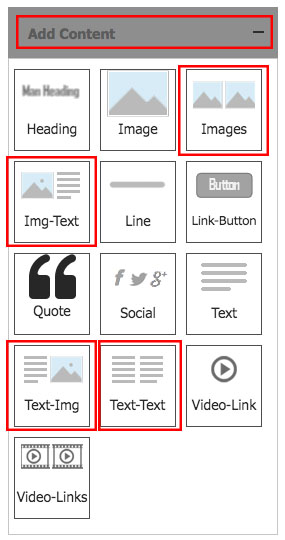
Content Blocks that will stack on narrow screens include:
- Images (2 images side by side)
- Img-Text (image on left, text on right)
- Text- Img (text of left, image on right)
- Text - Text (2 bodies of text side by side)
This is a responsive design. If we were to keep text and images side by side on a narrow screen, the text would either:
- get too small to read
- the text column beside the image would stretch vertically to fit all the text at the standard font size.
Since we do not want either of those behaviors when viewing on a mobile device, this is our solution.
These same content blocks will view as side by side on all other browsers or email clients such as Outlook/Apple Mail.
01292018