Your images should look just as good on mobile devices, such as smartphones, iPads, and tablets, as they do on a desktop computer.
One thing that may affect the look of your images is if you use a template with the Masonry layout of thumbnails and you have images that are taller than they are wide. The tall photos may stretch in order to fill the width of the column.
Our templates use 2 layout styles for thumbnails:
Masonry and Row
Masonry (Pinterest style) is a grid layout that sorts images by height, like fitting stones in a wall.
Click Here for this SitePoint.com article:
Understanding Masonry Layout
Row layout simply puts your thumbnails in a row.
Click Here for a list of Masonry Layout Templates
Click Here for a list of Row Layout Templates
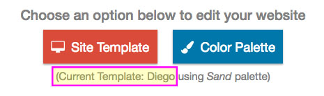
To see what template you're using and/or change your template:
- login to FASO account control panel
- click Design icon (upper row)
You will see the name of your template below the red and blue buttons.