If there is incongruity in sizes of the zoomed view of your artworks on your site, read on.
The size of the image is set by the main (unframed) image. This is especially true if you have multiple images of the piece as in these examples:
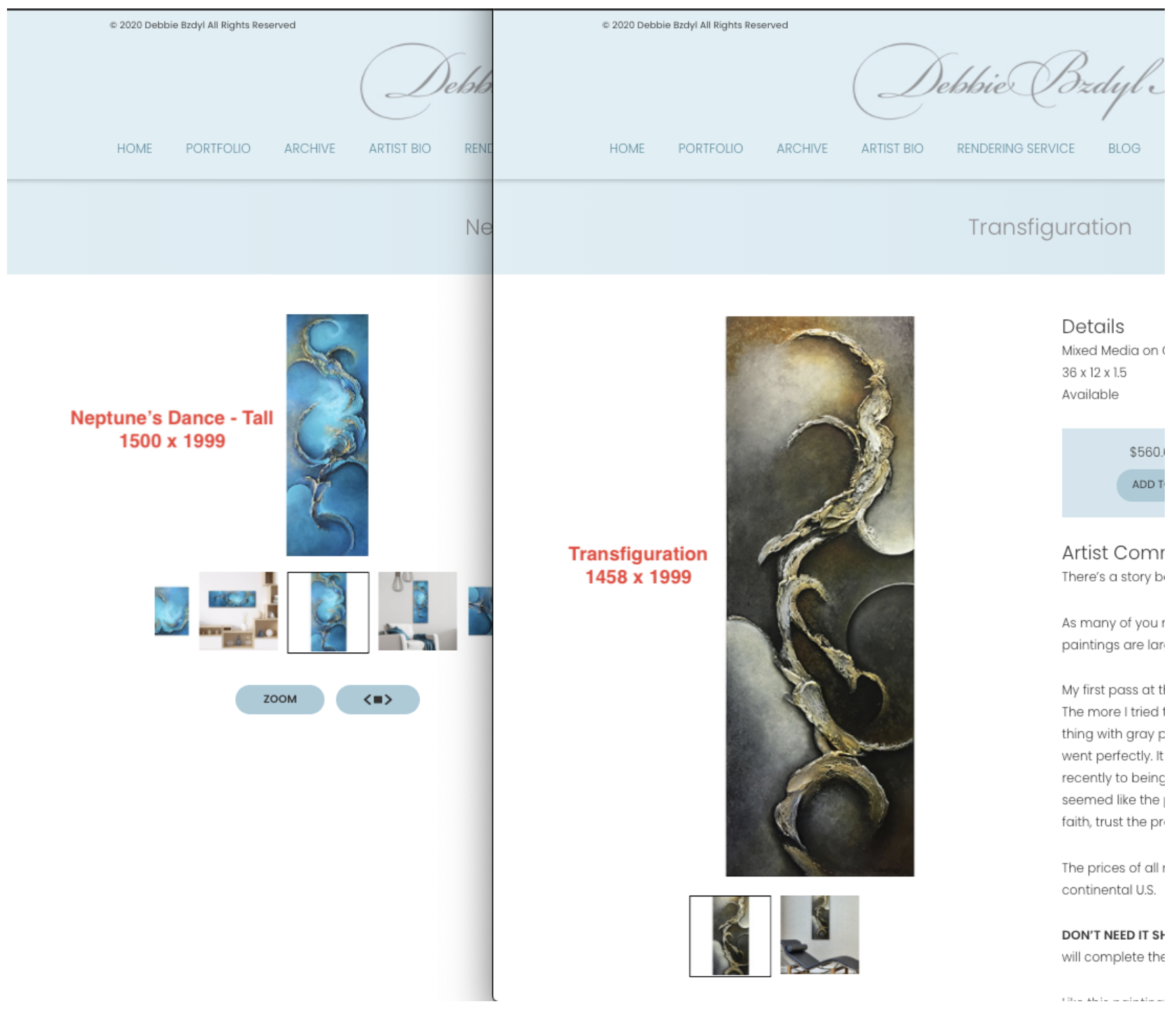
Here's Why
The main image sets the size 'cue' for the rest of the images: Additional images will be "boxed into" the area that first image created.
At the same time, the size of the main image is restricted by the available space provided by your template choice. It also varies by device and screen size! (Just to add to the complexity.) We also provide a "source set" of images to allow the browser to choose the highest resolution image that will work on the user's device.
Hence: Wide images will be shorter than tall images; tall narrow images have more room to stretch wider, making them taller at the same time.
It needs to be this way, we promise. It allows for the best possible adjustment for any image size and aspect ratio of all the varieties you may upload.
Usually there's no issue, except when an artist's work is very tall and narrow, or very wide and short.
Solutions
If it's troubling you, we suggest one of 3 options for a more uniform appearance:
a) When adding multiple images of an artwork, avoid mixing images of different orientations (landscape vs portrait), especially if the aspect ratios are very different from each other.
(Aspect Ratio = ratio of width to height. For example: 12:12 is square.)
b) Try to use images of similar or identical aspect ratios. You could make them all square with white/black around them, much as you would on Instagram.
c) If multiple aspect ratios are necessary and size consistency is key to you, then use editing software such as Photoshop to create custom images of the same aspect ratio (such as 4:3) and manually fit all the images inside that area.
Epilogue
This is all essential for best resolution in a world with so many devices, screens and sizes. For example, Apple retina screens are 4X the resolution of regular screens! We do not recommend customizing for this, since our resolutions have been optimized for countless device types. (Also, Custom Work is $120/hour.)
11112020 jyc