With the advent of mobile devices, website formatting options needed to be reevaluated, especially regarding the use of tables.
We understand an artist's desire to be creative with the arrangment of elements on the pages on their website. However placing images and/or text side by side requires the use of tables.
Tables should no longer be used for design and never should have been. This fact has become more and more important in a world of multiple screen sizes.
Essentially, tables should ONLY be used for tabular data.
With the advent of mobile viewing, designing with tables is now HEAVILY frowned upon because of different screen widths. If you choose to use tables, you are essentially forcing a layout to work in a way it was not designed.
How can someone do a layout with a table that looks good on a screen that is 1024px wide (desktop) and expect it to look good on 320px wide (iphone) screen? Unfortunately it can't be done.
We're moved into a world where people view things on the web in many different places and ways. The concept of a single layout has quickly gone out of date. Think about it: desktop view, desktop view with window full screen, desktop with window made smaller, iphone/smartphone, RSS feeds, apps that bring in data, ipad screens, small tablet screens.
The goal of the FASO developers is to design templates that present the data in the best way for multiple screen sizes.
In essence it may, for example, look good to have the artist photo to the left and the text on the right when viewing your website from your computer monitor. But on a smartphone, it makes more sense to show the artist photo on top and the text right below it, with little formatting. This makes the photo easier to see and the text easier to read.
The main action on a mobile device is simply to swipe up to keep reading. If we force the mobile device with tables, it will make something in the content too small and the viewer will be forced to pinch to zoom in and then back out. Zooming isn't the end of the world, but it's far from ideal.
Bottom line is mobile designs and tables do NOT play nicely with one another and hence are not recommended.
How to Create a Table in Full Screen Mode (not recommended)
Taking the above info into consideration, you are certainly free to use tables.
If you decide to format content using tables please be sure to view your website on a 3" screen as you work the design so that you can create the look you want at the same time as making sure that it will display well on all screen sizes.
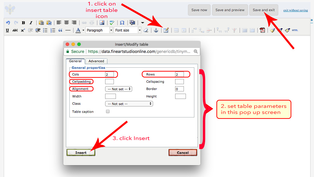
To create a table and get the columns and rows:
- access the editing screen for the page you want to edit
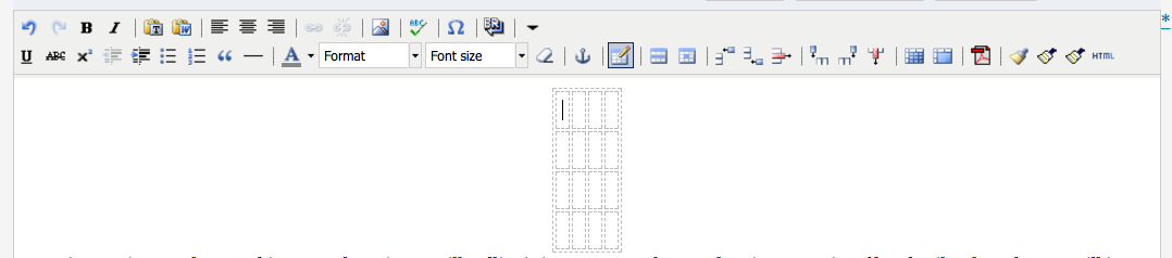
- Click the Full Screen Mode button (bottom left of text area)
- click drop down arrow on right of top row tool bar (to access the 2nd row of tools)
- On the second row of buttons, click the Insert Table icon (first one on the left)
- Select the size of your table by changing the Col and Row numbers
- Click Insert when you have the right parameters filled in
- Activate your cursor in individual cells to enter text and/or images to each cell.
The boxes will grow as you add content.
- To add an image to one of the cells:
place cursor in the cell and click it so it recognizes the cell
in top toolbar, click Insert Image icon, 5th from the right
follow the prompts - When you get the look you want, click Save and Exit (upper right) to return to the main editing screen.
Additional helpful info:
Instructions on how to clean up an incorrectly formatted page.
02022013 - 104061 & 09272017