FASO's mobile responsive templates are designed to display well-formatted website content on various screen sizes ranging from a large desktop monitor to a small mobile phone.
Keeping this in mind, we recommend not forcing elements to look a certain way. A design where you place an image and text side by side may look great on your desktop computer but on a narrow screen, the text will either:
- get too small to read
- the text column beside the image would stretch vertically to fit all the text at the standard font size.
Neither of these behaviors will give you the look you are striving to create.
Sometimes letting elements (text and images) simply stack normally, one above the other, is the best (and easiest) way to go.
If you still wish to add an image and place text to side of the image, here are the steps using the About the Artist page as the example.
- log in to your FASO control panel
- click on About (left menu bar) - or click on More Categories to find the page you wish to edit
- add text
- insert image into text box by activating your cursor at the start of the text
See this FAQ:
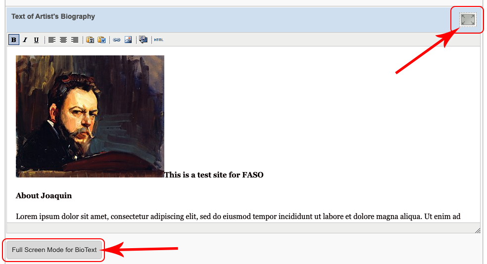
Add Image to Text Editing Screen - click Full Screen Mode for BioText button (bottom left)
OR the postage stamp icon (top right)
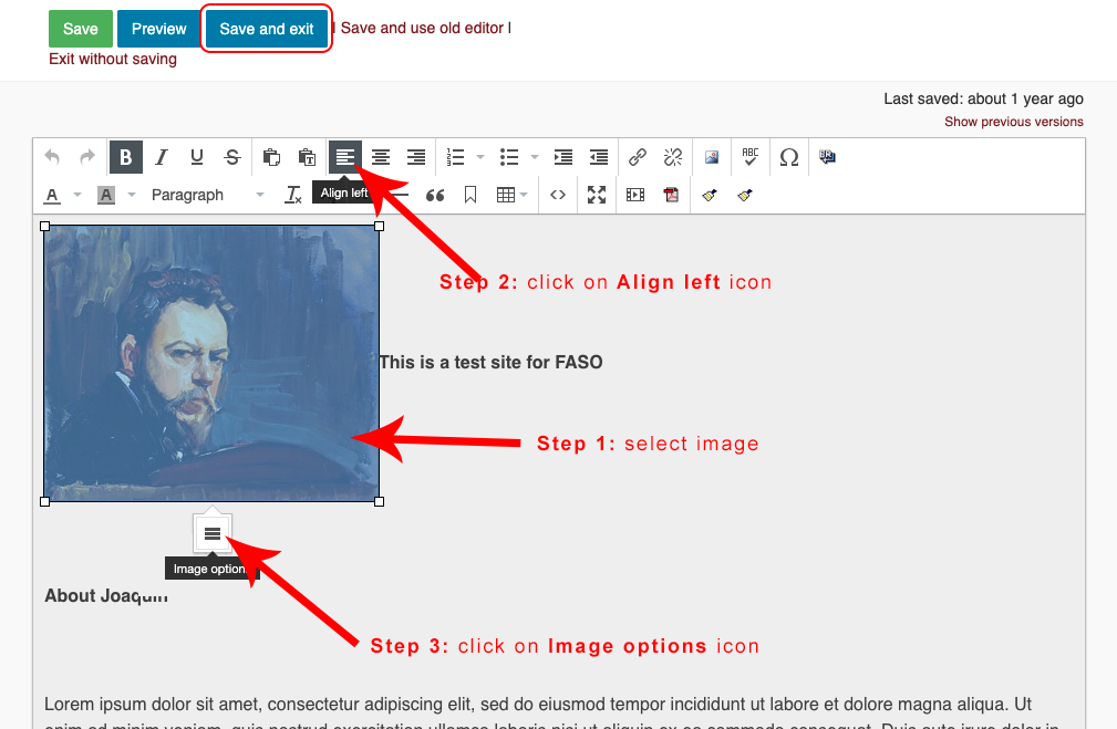
- click on the image to select it
- click on Align left tool (upper row) or Align right depending upon your needs
- click on Image Options icon
NOTE: This may not work in every browser.
We recommend Chrome or Firefox for this particular functionality.
- click on Advanced tab
- Add a number for pixels to both the Vertical space and Horizontal space fields. (usually a number between 3 to 15)
This will put some space between images or image and text.
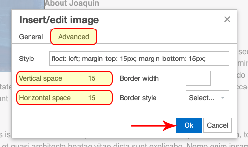
- click OK
- click Save and exit (upper left)

|
Be sure to check the look on a small mobile device. |
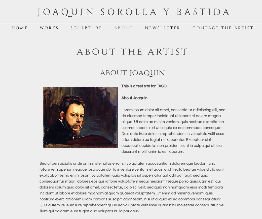
Screenshot of the finished look on the website:
06162022